
The challenge
I picked up gardening in the middle of our numerous lockdowns. As a product designer, I tend to apply design methodology to most things in life. So, I started researching how to grow veggies and herbs at home. I realised that the setup is one of the most critical steps in growing healthy crops. Climate, surface area, soil type and most importantly, timing are key data points to consider when you want to grow…anything.
All this information is documented online and in books: but it is an absolute nightmare to consume. Why? Because it isn't catering to anyone in particular.
The more I learned about plants, seeds, climates, seasons etc., the more I thought about designing and building a tool to help me digest this content. As a designer, I really wanted to fire up Figma and put some wireframes together. But, the last app I launched on the app store taught me that the database structure and the content that lives in it is what matters early on. More so than however fancy I make my designs look.
So, with no knowledge of how to build an interactive database, I decided to build an interactive database.

Methodology

That's where my favourite tool from the interweb those last few years comes in; Coda.
Coda is a little bit magical. It is as if JIRA and G-SUITE had a baby together. It's a tool a Portfolio Lead introduced me to for planning and tracking workload at work. Technically, it's nothing more than a tool to document things (think GDOC) and create tables (think GSHEET). But in practice, it is a lot smarter than that.
The end goal was simple and summarised in one job-to-be-done sentence:
As a user from Cairns, I want recommendations on what to plant in June to have a successful harvest in a few months.
I divided the workload into three chunks of work with a specific goal for each piece:

Content: A plant database. With information about 50 plants that I knew would be somewhat easy to grow or at least accessible for anyone like me. (Aka: Your average Joe).
🌱 What I did: One of the end goals is to display a link to purchase seed packets online. So, I started from the end and looked at the data available on seed resellers across Australia. Each seed has about 10 data points attached to them. Name, picture, description, time til harvest, max height, required exposition, soil type, a URL to a shop etc. Every seed went through a curation process to fit the plants I think the target audience will want to grow.
💡 What I learnt: The structure of information in Coda is essential. And, you want to get it right early. All the data above lives in a 'master' table. It's is the brain powering everything; it is the database. Some data points live outside the master table, in what I call 'reference tables'. I use the references in the master table for all the repeated fields (i.e., sun requirements) and my custom interactive filters.
Hierarchy of information: "Stop overwhelming users with content" is the primary goal here. With many data points to display, it is critical to define the correct order, the right amount, and the right time.
🌱 What I did: I looked at various planting charts and went to Bunnings in their seed section. The amount of information presented to users at once is astonishing. I defined a basic set of 3 questions required to inform accurate recommendations on seeds you should plant: user's geographical location, time of the year and patience level.
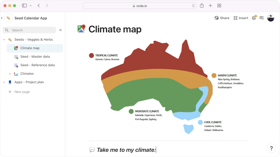
💡 What I learnt: Australia has multiple climates. I simplified them to 4 (Tropical, warm, moderate and cool) before mapping out all my plants (50 of them) to each climate. It was tedious, but I only had to do it once. I had everything I needed using the same reference tables logic to manage all the information related to time, city and climate. I had just built a dumb (but digitised) planting chart. Yeah!
Interactive filters: Coda allows its users to get going with minimal coding knowledge. I'm far from knowing what I'm doing with code, but I knew this was a key component for my proof of concept.
🌱 What I did: Simplicity is key. At the end of the day, it's just a bunch of pages and tables. Using a funnel principle, I built a series of questions that would guide me to the correct bucket of information.
Step 1: Show a map and allow the user to select their climate
Step 2: Select the time of the year & time until harvest
Step 3: Display the recommended seeds to plant
💡 What I learnt: You can really cut down on the amount of unnecessary information when you ask the right questions. And as long as your data is clean and you have your logic on paper, tools like Coda are more than capable of building some pretty cool little prototypes.
Solution
This tool allows users to select their climate (within Australia), the time of the year they want to plant and how long they want to wait until harvest. With this information, users are presented with a handful of seed recommendations matching the criteria. They can then learn about the recommended plants and make informed decisions on what to plant.


Outcome
The proof of concept is fully working in Coda. 50 plants are mapped out across 4 different climates covering all of Australia. With the help of a friend, we've already repurposed the database to another user pain point: "I live in Sydney, I want indoor plants for my well-lit living room, but I don't know what to get".
Design and build for both applications (seeds & indoor plants) are now in progress.